Loading more posts...
Design
-
Navigator.pub
-
10 Posts
-
8 Websites
Substack
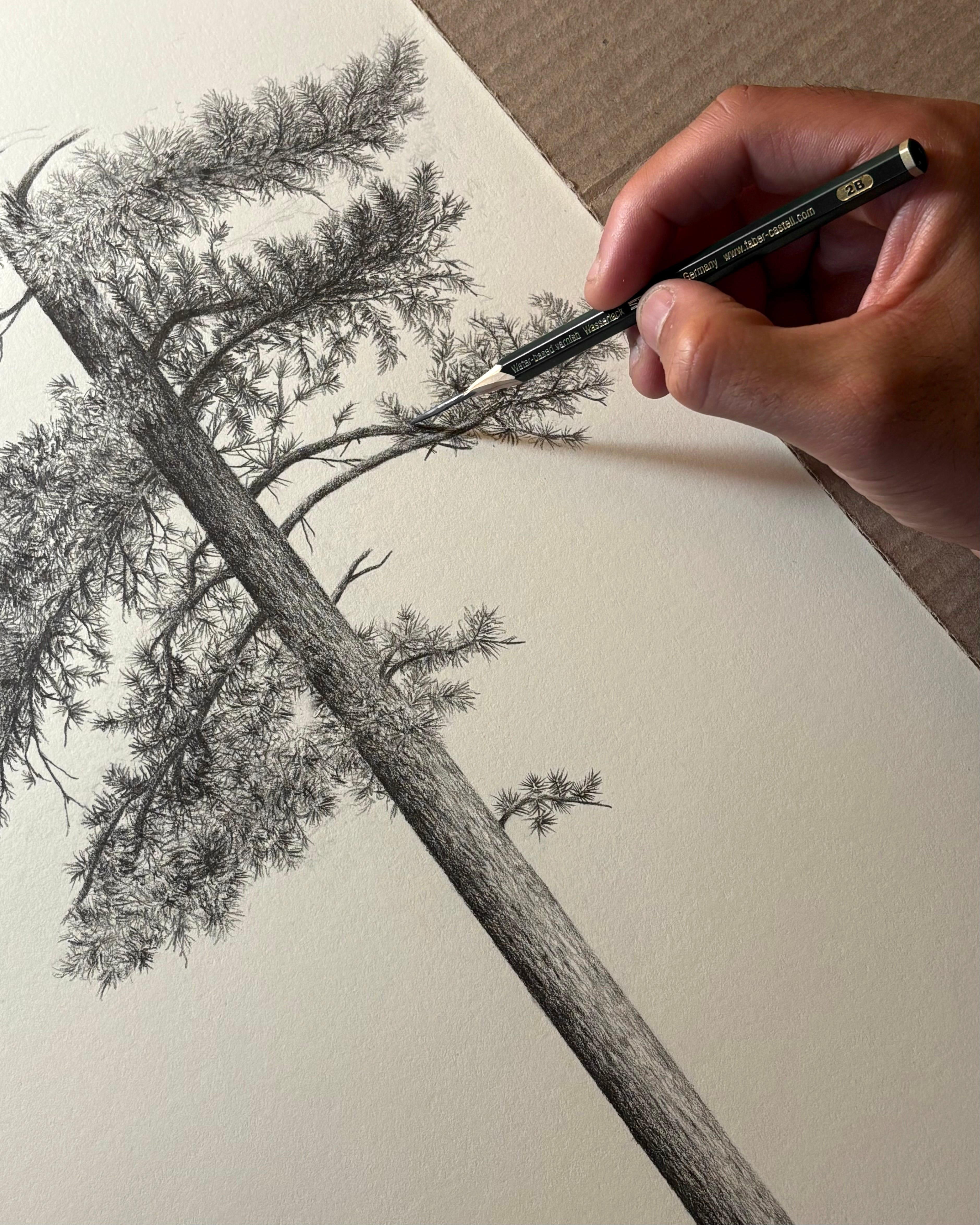

Parker Thornton (@pthornton): "Currently working on a very large commissioned drawing of a Ponderosa Pine (one of my favorite trees). Excited to share the finished piece soon! Commissions are open for those interested. "
Currently working on a very large commissioned drawing of a Ponderosa Pine (one of my favorite trees). Excited to share the finished piece soon! Commissions are open for those interested.
Printmag
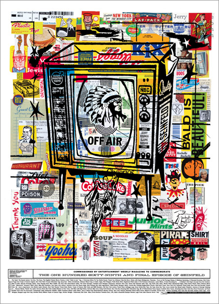

The History of Graphic Design – PRINT Magazine
Laurence King Publishing recently released two “mini format” editions of books originally published ten years ago: “American Modernism” by R. Roger Remi…
Patricknagel
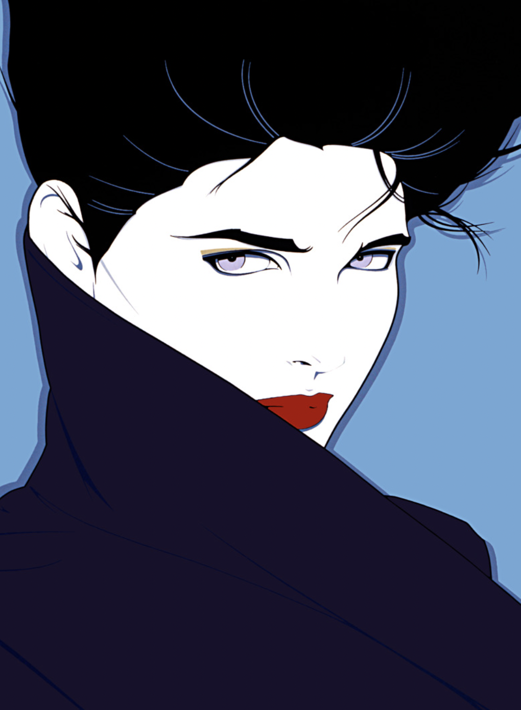

Patrick Nagel
The Pop Art of Patrick Nagel needs little introduction. His minimalist style defined an era with cool, seductive women that became the most iconic of any single generation. His elegant graphic work and his portrayal of the contemporary woman made figurative design before him look instantly old. Today his unique sensibility and style continue to resonate with generations of young designers, illustrators and artists who have found inspiration from his trend-setting style. Nagel was in the forefront of a new wave of illustration in Los Angeles in the late 1970’s and early 80’s, re- imagining the graphic arts and in the process defining Los Angeles as the epicenter of award-winning visual arts. It was a reciprocal relationship; Los Angeles influenced his evolving style and in return he left his indelible mark on the city and far beyond. Through cultural cross-pollination, his work absorbed the moment – from the fashion photography of Guy Bourdin and Helmut Newton to influencing the look of music videos by David Bowie, Robert Palmer and George Michael, to creating the album cover art of Duran Duran.
Instagram
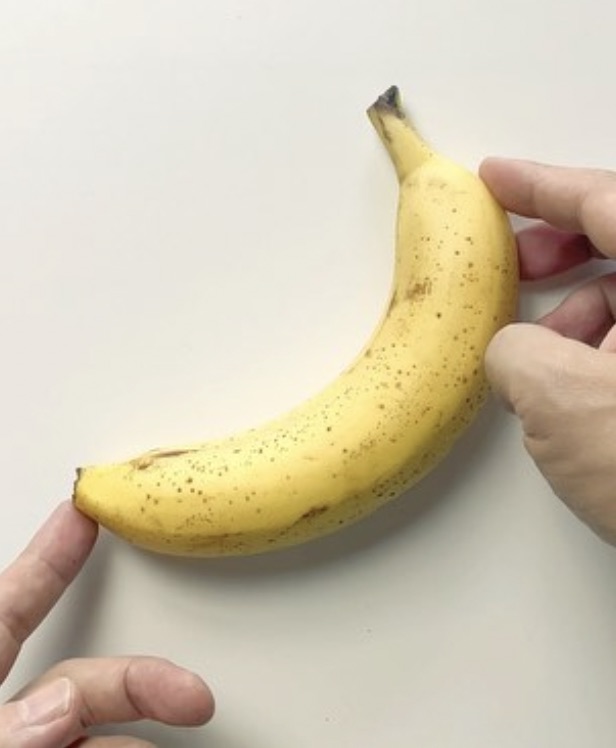

Kensuke Koike 小池健輔 (@kensukekoike) • Instagram photos and videos
361K Followers, 172 Following, 1,143 Posts - Kensuke Koike 小池健輔 (@kensukekoike) on Instagram: "Alchemist"
Youtube
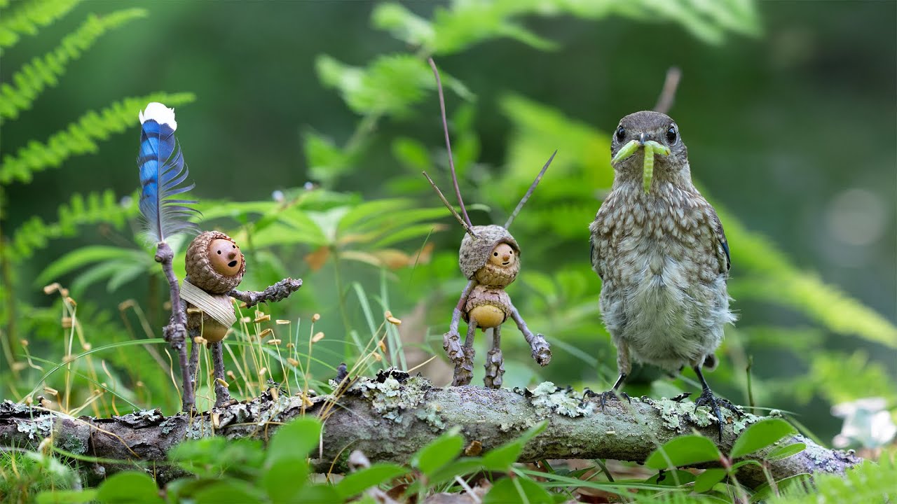

Becorns Episode 1: Bluebirds
Becorns are little people I make out of acorns and sticks. Then I photograph them in nature with real animals. In this video, I share my process for taking photos with some Eastern Bluebirds. Learn more and buy prints and stationery at: davidmbird.com. EDIT: Hi folks. I appreciate the concern some of you have for the well being of the birds. I share your feelings and also felt very protective of their little family. Here are some precautions I took: - To protect from predators, I built the birdouse and baffle according to the recommedations by the Connecticut Audubon (see below for link). The second platform was only in place during photography sessions when I was able to monitor for predators. - It’s recommended to check Bluebird boxes at least once a week. From my research online, I learned that bluebirds are actually quite tolerant of humans. I opened up the box briefly every five days, and stopped when they had feathers and there was risk of birds jumping out. I only opened the box when the parents were away collecting food. Here are some resources I called upon: portal.ct.gov ourbetternature.org I’ve since come to understand that it’s illegal in the US to collect migratory bird feathers without a license because it violates International Migratory Bird Treaty Act of 1918. The treaty makes it unlawful to hunt, take, capture, kill, or sell migratory birds. The statute extends to any bird part, including feathers, eggs, and nests. I found the bluejay feather on the ground, but there’s no way law enforcement could know that, thus the blanket regulation. There are plenty of bird species that aren’t protected though. Time to find some chicken feathers! My goal is to honor and respect the animals, and I hope that by sharing what I learn about them, we all can expand our appreciation and respect for them.
Youtube
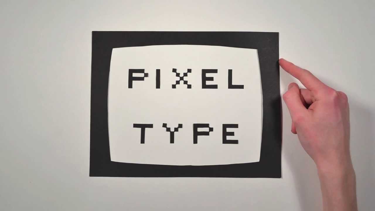

The History of Typography - Animated Short
A paper-letter animation about the history of fonts and typography. 291 Paper Letters. 2,454 Photographs. 140 hours of work. Created by Ben Barrett-Forrest © Forrest Media - 2013 benbf.ca Information Sources: Thinking in Type by Ellen Lupton Just My Type by Simon Garfield If this video sparks any ideas, I would love to hear about them! Script: Type is power. The power to express words and ideas visually. It’s timeless, but always changing, and that’s what we’re going to explore. Most people agree that the creator of typography was a German man named Johannes Gutenberg. (And yes he wore a hat like that). Before Gutenberg came along and revolutionized the world of communication, books needed to be scribed by hand, usually by monks, which was very time-consuming and expensive. So Gutenberg created Blackletter, the first ever typeface, modeled after the writing of the scribes. Blackletter has thick vertical lines and thin horizontal connectors which made it great for scribing but it looked very dense and squished together when printed. Things needed to change. Enter Roman Type. Now this typeface is Cambria, which you're probably used to seeing on your word processor, but the first ever Roman typeface was created in the 15th century by Nicolas Jenson. Jenson worked mainly in Venice, Italy, and was inspired by the lettering found on Ancient Roman Buildings. His letterforms were based on straight lines and regular curves, which made it much more legible compared to the dense darkenss of Blackletter. This typeface was an instant success and quickly spread across Europe, riding on the coat tails of the renaissance. The next major innovation in typography after roman letters was italics, which are like slanted and stylized versions of roman type. They were created in the late 15th century by Aldus Manutius from Italy as a way of fitting more letters onto the page and saving money. Now we use italics interspersed in roman type for emphasis. Aldus Manutius also created the modern comma and semicolon, but that’s another story. Type development stayed fairly stagnant until the 18th century in England, when William Caslon created a typeface that set a new standard for legibility. While it wasn’t anything radical, it was just what the world was looking for. The style of Caslon’s typeface is now referred to as Old Style. A few decades later, another Brit named John Baskerville created a new variety of typeface, which we call Transitional. Later still a Frenchman named Didot, and an Italian Named Bodoni created typefaces that we have classified as modern. Most serif typefaces fit into one of these three categories, but what does each one mean? An old style typeface has letters that have thick serifs, and low contrast between thick and thin strokes. A transitional typeface has letters with thinner serifs and a higher contrast between thick and thin strokes. And a modern typeface has letters with very thin serifs and an extreme contrast between thick and thin strokes . Next, William Caslon’s great Grandson, named William Caslon IV, got sick of all of these serifs, so he decided to remove them entirely and made a new kind of typeface called a sans-serif. It didn't catch on immediately, but would eventually get really big. During the second industrial revolution, advertising created a need for new typefaces. Letters were made taller, and wider, mainly used in large sizes on posters and billboards. Things got pretty weird, but one happy result of all this experimentation is Egyptian, or slab serif. It has really thick serifs and is usually used for titles. As a backlash to the complexity found in typefaces of the 19th century, the early 20th century brought something simple. Paul Renner from Germany created a typeface called Futura and it was based on simple geometric shapes. This is called a geometric sans. Around the same time a British man named Eric Gill created a typeface called Gill Sans that was similar to a geometric sans but with gentler, more natural curves, and this is called a Humanist sans. The next major step in the world of sans serifs happened in Switzerland in 1957 with the introduction of Helvetica. It has simple curves and is available in many different weights, and some would call it the world’s favourite typeface. The world of typography changed forever with the introduction of the computer. There were a difficult few years of crude pixel type due to the primitive screen technology. But then technology evolved and computers began to allow for the creation of thousands of beautiful typefaces. And the odd, ahem, dud. But now anyone has the freedom to create their own unique typeface. And that is the history of typography.
Behance


Blog :: Top Creative Trends of 2025 :: Behance
Blog :: We analyzed thousands of top Behance projects from this year to identify the top trends that pushed creativity forward in 2025.
Companyfolders
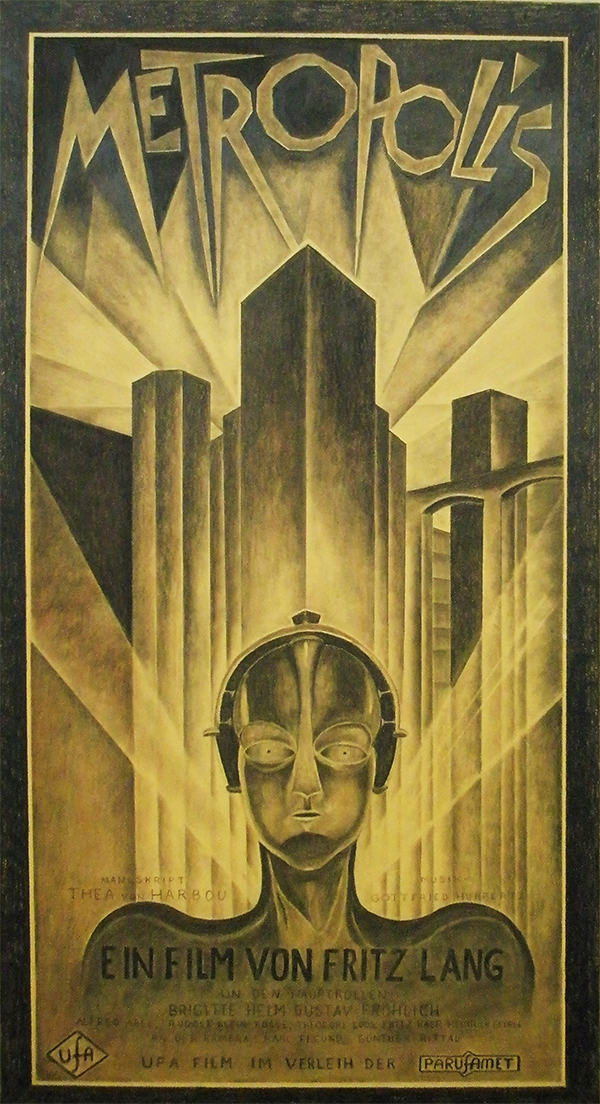

24 All-Time Best Movie Posters with Great Designs
These 24 stunning designs prove that movie posters are their own form of art, and they offer valuable lessons in graphic design along the way.
